Hello Folks,
Sounds like you have finalized on a design but I just saw the Logo ideas yesterday and I put my two cents into Photoshop and modified these ideas a bit.
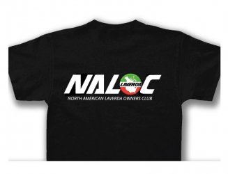
Using the Laverda name/font, I modified it a bit to spell NALOC.
The images are in the Gallery at: http://www.laverdaforum.com/gallery/index.php?cat=10265
I think incorporating the badges into the design is great! But I wonder if the detail in these images is too complex to render with silk screening. Maybe I am too dated and a digital printer can handle these details.
I did not do this in my images but was wondering about running the Green, White and Red colors as stripes through the text NORTH AMERICA LAVERDA OWNERS CLUB.
So the top third of all the text is GREEN, the middle third is WHITE and the bottom third is RED.
Two things about this idea:
1. This might cause a headache to keep these colors in register with each other. Again old school thinking (see above)
2. This could decrease the legibility of the text. Personally I think the White text on a Black T is most legible. And looks best with White NALOC text.
Another idea for coloring the text is to color in groups of three; first group Green, second group White and last group Red.
anyway here are my take on your previous ideas. I hope I am not stepping on any toes, I just saw this yesterday.
Larry